101Turn
Graphic & UI/UX DesignDrawn

Does your product look as good as it works?

First impressions happen fast. If your design looks patched together, inconsistent, or five years out of date - customers notice. And they leave. We help fix that, whether you need a full brand refresh, a better product UI, or a design system your team can actually use.

We design interfaces and identities that survive contact with engineering. Every screen is handed over as a system - tokens, components, states - so what gets built matches what was designed instead of drifting during the handoff.

Fixed priceagreed before we start
  • Sound familiar?
  • Your brand or product looks inconsistent across different places.
  • Users get confused and drop off before they reach the good stuff.
  • You don't have a proper design system - everyone's doing their own thing.

Deliverables

What you get.

01

Brand identity & logo systems

02

UX research, user flows & wireframes

03

High-fidelity UI design in Figma

04

Reusable design system & components

05

Marketing & social graphics

06

Design-to-dev handover

Drag or swipe

Tools & approach

  • Figma
  • Adobe CC
  • Framer
  • Spline
  • Design tokens
  • Lottie

The work

How this runs.

  1. 01

    We learn what you're working with

    We understand your users, your goals, and what's not working right now.

  2. 02

    Structure before visuals

    We map out flows and wireframes first. No point making something pretty if it doesn't work.

  3. 03

    Design you're proud of

    High-fidelity UI with a component system your team can reuse.

  4. 04

    Ready for your developers

    Organized Figma files with specs and assets. No guesswork for whoever builds it.

Detail

Worth knowing first.

What's the difference between UI and UX design?

UX is the decisions: what the product does, in what order, and what happens when something goes wrong. UI is how that looks and feels once decided.

Products fail on the first far more often than the second. A beautiful interface over a confusing flow is a more expensive mistake than a plain interface over a clear one.

Why a design system rather than screens?

Screens describe today. A system describes every screen you'll need next year - spacing, type scale, colour roles, component states, and the rules for combining them.

It's also what stops the twentieth screen looking nothing like the first, which is the usual outcome when a product grows past whoever designed it originally.

Do you design for accessibility?

As standard: colour contrast checked against WCAG, keyboard paths that work, focus states that are visible, and text that resizes without breaking layout.

It's a small amount of work done during design and an expensive retrofit afterwards - which is why it isn't offered as an optional extra.

What do we receive?

A Figma file organised for building rather than presenting: components with variants, documented tokens, and specs for the states that mockups usually skip - loading, empty, error, too-long content.

If we're building it too, the design tokens go straight into code, so the gap between design and production closes to nothing.

Proof

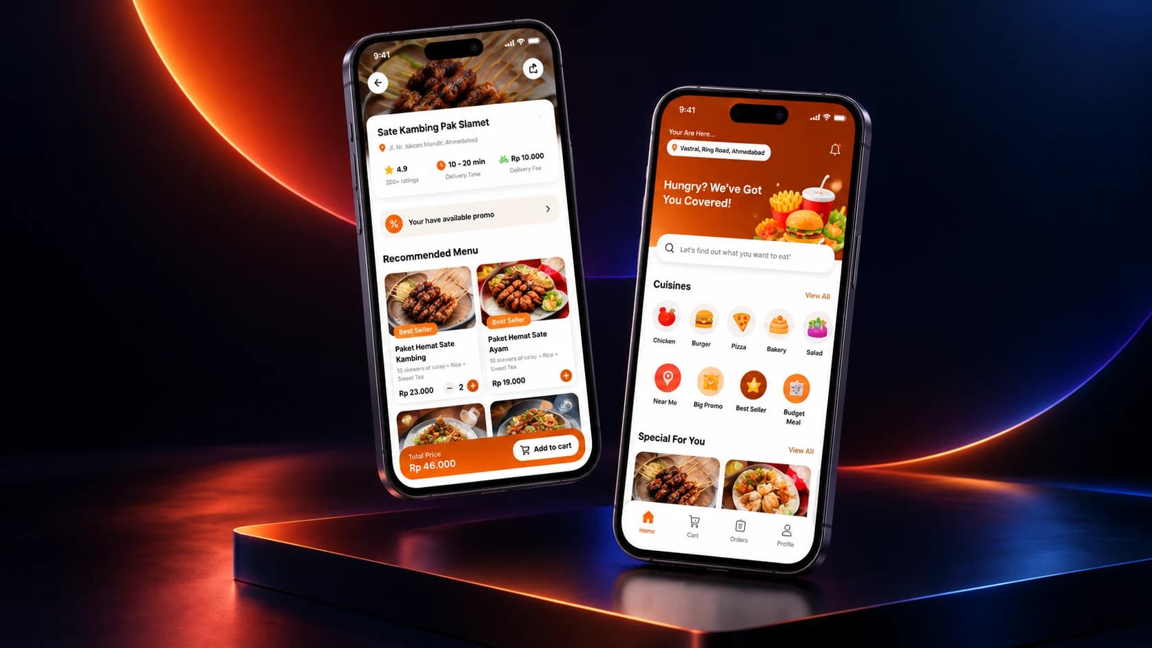
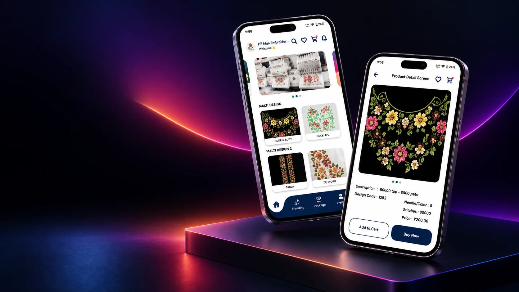
Graphic & UI/UX Design in practice.

Questions

Answered plainly.

Yes. We do brand identity, marketing graphics, and full product UI/UX. Useful when you want one consistent look across everything.

Start with graphic & ui/ux design.

Get a quote
Where this fits
  • SaaS & startups
  • E-commerce & retail
  • Health & wellness

Also known as

  • UI UX design services
  • Design system development
  • Mobile app UI design
  • Brand identity design
  • Figma design handoff
  • Web app interface design
Get in touch

Start with graphic & ui/ux design.

Tell us what you're working on and what's slowing you down. A short call is usually enough to know whether we're the right fit - no proposal required first.

Quick links

WhatsApp